TRAVEL. CAPTURE. CREATE. ThereGoesSaraRose.com
For years, I’ve followed my curiosity with camera in hand. I am attracted to color and new life like a bee to a fresh bloom. I’ve always been drawn to flowers and plants. I am especially captivated by spaces where color appears layered and weathered. These colors are imperfect and fight to be alive. Eventually the habit of noticing the small things becomes a routine, and then a mindset. Now, if I am ever “stuck,” I return to this growing library of colorful photography for inspiration. And now, you can too.
The best example I can give is a quote from Suzanne Collin’s The Hunger Games. In it, Peeta shared his favorite color, saying, “Orange […] more like a sunset kind of orange.” Orange is not typically a favorite color. However, in the context of a sunset, it’s undeniable that it’s one of the most beautiful sights in the sky.
Why does this matter? When you make a habit of learning art theory and design, your work slowly becomes less about you as the creator. It becomes more about the people experiencing it. For example, take the color blue. Blue evokes feelings such as trust, honesty, and calmness. If you work in healthcare, you may see a lot of blue in your design work. You may also use a lot of blue in your design work. The worlds of design, branding, and marketing would say this is both a wise and strategic choice for healthcare design.
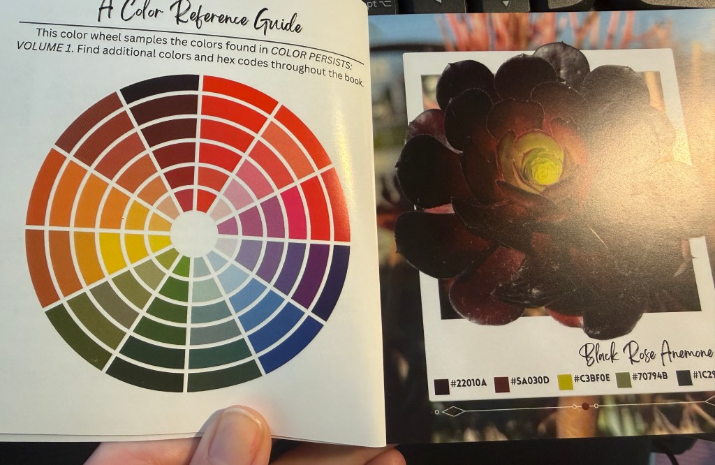
Our creative streak doesn’t end at 5 p.m., though. What color combo are you wearing to your friend’s birthday dinner? When searching for a pop of color, does your design-mind revert to tertiary and contrasting colors? Stuck in the methods we were taught? Not breaking a mold? This is the reason I find nature photography intriguing. It focuses on capturing saturated colors or unique combinations. This approach challenges that part of our honed creativity. Would you wear dark reddish brown with a pop of chartreuse? No? Well, the Black Rose Anemone dons it every day and it is stunning!
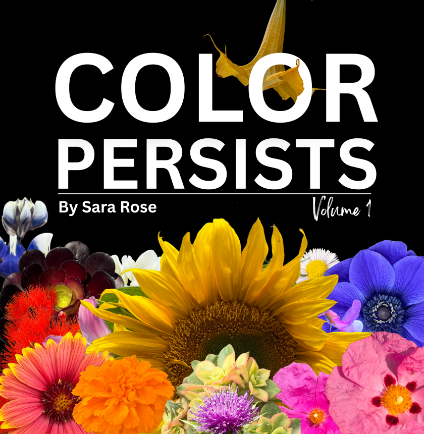
COLOR PERSISTS, do you?
Color doesn’t disappear just because trends say it should soften. It doesn’t apologize for being loud, layered, or alive. It persists — in cracked sidewalks, in stubborn petals, in unexpected combinations that shouldn’t work but do.
COLOR PERSISTS: Volume 1 is my reminder to myself — and now to you — that inspiration doesn’t need permission. That beauty isn’t only found in perfection or palettes approved by an industry forecast. Sometimes it’s found in contrast. In courage. In choosing saturation anyway.
So I’ll ask you the same thing I ask myself:
COLOR PERSISTS — do you?


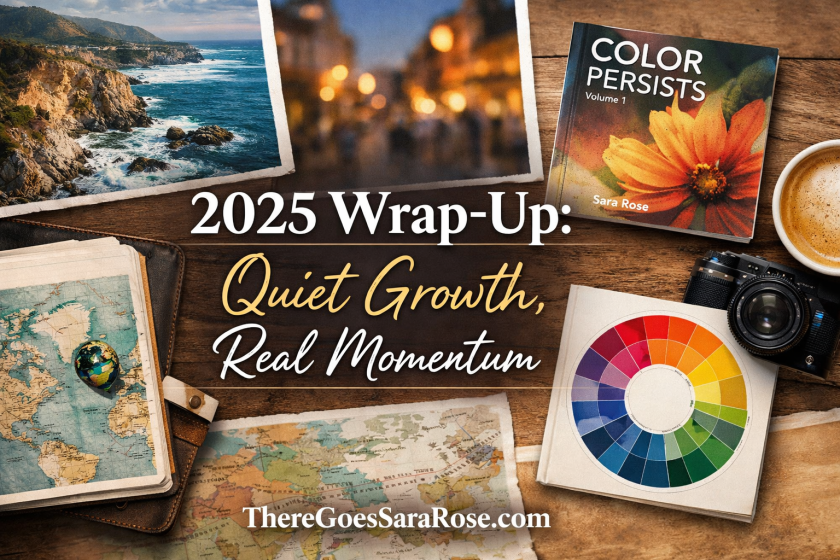


Love Sara’s Photos? Own Your Own Here!


One thought on “Out Now! Color Persists: Volume 1 || ThereGoesSaraRose.com”